Showing posts with label book cover. Show all posts

Sunday, October 22, 2017

Book Cover Design

Book Cover Design
By James M Jackson

Raise your hand if your mother or a teacher ever said to you, “Don’t judge a book by its cover.” Do you believe it? I do. I’ve seen book covers that have only the title and the author’s name in common with the book inside. Book cover designers are not paid to have you judge a book based on their design; they’re paid to have you BUY THE BOOK based on its design, or barring that, at least pick the book up or click on the electronic “See inside” button.

While I wait for my editor to return Empty Promises (Seamus McCree #5) to me, I am working on the first draft of False Promises (Seamus McCree #6) and planning the marketing for Empty Promises. One large component of marketing is developing the book cover.

One of my favorite authors is John Sandford. I have read the entire Prey series featuring Lucas Davenport. I thought it would be fun to look at what has happened over time to the cover of Rules of Prey, the first in the series.

Here’s the hardcover first edition (1989):

Plain black background. Title large and red. Debut author’s name medium and white. A yellow note with black print of one of the rules, and a red fingerprint. Notice at the small size I have made the cover (thumbnail size these days) you can easily read the title and the author. The yellow note is unreadable.


Here’s the 2001 edition:

The black background remains, as does the red title, which is now even larger. John Sandford’s name is still the same size, but also red (and so it doesn’t stand out). The rules note has been simplified (no longer uses one of the actual rules), the note color is not as vibrant, and the red fingerprint remains.

In addition, we have a shouted blurb at the top: “THE TERRIFYING NEW YORK TIMES BESTSELLER introducing Lucas Davenport in the smash debut thriller by the author of Silent Prey”

So, Lucas Davenport has become a marketing name and it ties into Silent Prey, book #4 in the series (1992).

By 2005 we have more changes:

The color scheme is completely different, with a construction-worker green background on top and white on the bottom. Author and title are now both large. The yellow note aspect is captured in the “E” of Rules.

The longwinded promo at the top is replaced by “#1 New York Times Bestselling Author” (notice no all caps shouting) AND a blurb by Stephen King.

The rich get richer, don’t they?

A year later a paperback edition had a different cover:

It’s a throwback, with the black background, larger title than author (although the author has a different color), and the original note has returned, but large enough you can read it.
The Stephen King blurb is in the slash at the bottom left. When you get a blurb from King, you keep it.


Here’s the current edition:

New set of colors. Author and Title with equal size, but different colors. They’re back to shouting #1 NEW YORK TIMES BESTSELLING AUTHOR, the Stephen King blurb is still present.

They’ve added “A Lucas Davenport Novel” in a color that stands out, and it and the title are skewed in such a way to imply 3D.

And look behind all the words: a picture or at least an illustration of a scene! That’s very different from any of the previous versions.

The Lucas Davenport series has utilized the word PREY in every title. I’ve heard many people refer to the series as the PREY series, although I’ve always thought of it as the Lucas Davenport series – I must not have been alone.

There have been a gazillion other covers along the way for different foreign markets, audio books, etc. I picked just a few to illustrate the changes.

Isn’t it interesting to see how one book’s covers have changed?

Here are my current five Seamus McCree titles (four novels and a novella):


Some consistencies: A big title. Author’s name in white print and relative small (who the hell knows me, right?) A subtitle “A Seamus McCree Novel (or Novella).

And here’s my stab at a cover for Empty Promises. I’d love to know what you think: good, bad, indifferent.


Sunday, February 26, 2017

Cover Wars

By Jim Jackson

For the past week, I have been filling out a questionnaire that will provide the basis for an interview to appear in a magazine later this year. I’ll leave you in suspense about the details so I have fodder for a future blog. One of the questions was, “How did getting/being published change your life?” My response was that after publication I spend much less time on pure writing and significantly more time on sales and marketing activities.

To my way of thinking, it’s all about exposure. I have faith that my novels are well-written and a certain segment of the reading public will like them—but only if they get a chance to read them. The problem is to find ways to make those potential readers aware of my books so they can find out for themselves just how good they are.

Since you never know what works until you try it, I experiment with different promotional opportunities. One I tried last year is called “Cover Wars.” The concept is simple: every week fifteen book covers are displayed on a webpage. The public can vote for the best cover, and the winner receives some free promotion on the website that sponsors the contest. It costs nothing for an author to participate.

Now, I think my Doubtful Relations cover is a really good cover – the kind of cover that makes you want to pick up the book and find out more. I’m prejudiced, of course, but you can judge for yourself. I signed up, waited a couple of months for my turn to participate, and early one Sunday morning the contest including my book opened.

I checked out the competition. There was only one other book that I thought was a contender. Now, those of you who personally know me know I am a teeny, weeny, bit competitive. I wanted to win. The rules were that repeat voting was allowed, but no more than once a day. But the reason I had signed up wasn’t to win; I hoped the exposure would intrigue some folks who did not know my books to give this one a try.

I posted about the contest on Facebook and mentioned it to the Guppy Chapter of Sisters in Crime, where I am currently the president. And, of course, I voted once a day for the best cover!

The other cover that should have been my competition garnered very few votes. The book that turned out to be my major competition was not a particularly strong cover; it was so busy the key message (title and author) was lost.

Some of my Guppy chapter associates got behind the contest in a big way, voting daily and encouraging others to vote. Had each of the chapter’s 700 members voted for my cover just once, it would have won by a landslide. Which tells you the contest exposure was small. The fifteen contest authors ginned up various amounts of support from friends, but there wasn’t a large group of folks out there in cyberland using this contest to find some great new books.

And that led to the marketing result: During the week of the contest, sales of Doubtful Relations declined compared to the average for the previous few weeks.

I also quickly recognized that the free contest was only free in terms of me not spending any money. I spent lots of time thanking people who let me know they had voted for my cover. And Mr. Competitive wasted mucho time tracking how my cover was doing compared to the competition.

I went to bed Saturday night with a very small lead, and woke up Sunday morning having lost by a bunch of votes. The winner had rallied her troops or bots or whatever for a last-minute push.

Lessons for me: Measure all the costs of a promotion, not just the cash outlay. Check some prior results to see the number of votes – that would have given me a clue that the contest was thin on reader engagement. Remember that whatever I tell myself about being disengaged from the result of a contest, I won’t be, so make sure to factor in all that wasted time checking to see how my entry in the race is faring.

So dear readers, where do you find out about new-to-you books that seem to be worth trying?

Saturday, February 22, 2014

You can’t tell a book by its cover…or can you?


Today on Salad Bowl Saturdays we welcome Judy Alter who offers some more insight into the "wonderful" world of book covers. ~ Jim


-----------------------------------------------------------------------------------------
It’s an old adage that you can’t tell a book by its cover. Regardless, I’ve heard many an author moan over their latest book cover. Indeed, I have done some moaning myself. My first three New York-published books were from Doubleday, in their DoubleD western series which went to a list of subscribers (mostly prisons, I suspect). The covers were ordinary and unremarkable, not designed to catch the reader’s eye on a bookshelf. One was Mattie, about a woman doctor on the prairies of western Nebraska. I made a point in the text that her soddie was at the only tree crossing of the river for miles—three lone trees. So there it was on the cover—an English-style thatched cottage surrounded by luxuriant greenery.

But the worst was to come. My first “big” book was for Bantam, a fictional biography of Libby Custer. On the cover, Libby stood in knee-deep prairie grass next to a barbed wired fence; in the background was bare red dirt around a log fortress. Yikes. I wanted to point out that Custer was killed in 1876 and barbed wire was experimented with in the early 1870s but successfully demonstrated in San Antonio in 1876—there was no way Kansas was fenced while Libby was there.

Worse, one friend said Libby looked like Madonna in 19th-century clothes, and another pointed out it was the ubiquitous West: Kansas in the foreground and Arizona in the background. In addition, there were no logs in the West for stockade fences (those were used in the East a century earlier) and Libby herself pointed out that she was surprised that western forts had no protective fence around them. But I was inexperienced, delighted to have a real trade book from a major eastern publisher, and I kept quiet…until it was too late.

One more horror story—I wrote a fictional first-person biography of  Etta Place’s years with the Hole in the Wall gang. A major point was that she rode with the gang on robberies, so what did the cover show? Men robbing a train, with no woman visible. Similarly, Ballad for Sallie, my story about a young girl who is a street orphan in Fort Worth in the late 19th Century, featured a gunfighter mounting his horse, guns blazing on the new print edition. Go figure.

I was once at a conference where a book distributor—the kind who puts books in grocery store racks, etc.—said openly he lays the covers out and picks that way without ever opening the book, reading a blurb or any advertising copy. He surely thought he could tell a book by its cover—or that buyers would.

All that said, I love the covers for the Kelly O’Connell Mysteries--kudos to Kim Jacobs of Turquoise Morning Press who designs them. She sent one for Skeleton in a Dead Space that I vetoed immediately—a skeleton in red and black with dripping blood wasn’t the mood of the book at all.

She agreed the free-lance designer had missed it and designed the cover of the book herself. It was smashing and perfect.


Judy Alter 
----------------------------------------------------------------------------------------------------------------
Murder at Tremont House is the second Blue Plate Mystery from award-winning novelist Judy Alter, following the successful Murder at the Blue Plate Café. Judy is also the author of four books in the Kelly O’Connell Mysteries series: Skeleton in a Dead Space, No Neighborhood for Old Women, Trouble in a Big Box, and Danger Comes Home. With the Blue Plate Murder series, she moves from inner city Fort Worth to small-town East Texas to create a new set of characters in a setting modeled after a restaurant that was for years one of her family’s favorites.

Follow Judy at http://www.judyalter.com or her two blogs at http://www.judys-stew.blogspot.com or http://potluckwithjudy.blogspot.com. Or look for on Facebook at  or on Twitter where she is @judyalter.

Saturday, February 15, 2014

The Evoloution of a Book Cover

In today's Salad Bowl Saturday post, author J. L. Abramo takes us on a fascinating behind the scenes exploration of how he and the graphic artist, Jason Smith, developed the cover to his novel, Chasing Charlie Chan was created. ~ Jim
-----------------------------------------------------------------------------------------------

When creating a book cover, the title of a novel is a major consideration. It is the author’s first opportunity to create some interest. For the new book, I was somewhat limited by wishing the title to start with a gerund beginning with the letter C—as with the three Jake Diamond novels—Catching Water in a Net, Clutching at Straws and Counting to Infinity. On top of that—it’s a good idea to have the title say something about the book. Chasing Charlie Chan worked both ways.

Given the title is critical, so is the manner in which it is presented on the book jacket—the cover being an equally essential piece of the presentation—the invitation to look inside. Jason Smith—who created the title artwork and hand painted the front and back cover images—allowed me into his world—staying open to my thoughts and ideas—working closely with me to come up with a design that would truly represent what lay in wait within.


There were two considerations when approaching the front cover. Down & Out Books, the artist and the author all agreed to work on a concept that brought to mind the noir private eye novels of the forties and fifties—Chandler’s Philip Marlowe and Spillane’s Mike Hammer—albeit without the damsel in distress. (Sorry, no scantily clad babes aboard.) I believe if you don’t grab the reader in Chapter One you have lost half the battle—therefore Jason and I decided on using an image which captured a moment in those first pages. Here is an early rendition.


It was Jason Smith’s idea to use a badge—a small representation of the main protagonist that could be used in subsequent books and add to the dime store novel feel. Here is an early version of the Jimmy Pigeon badge.


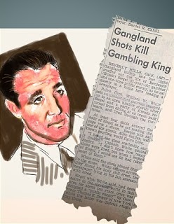
The book is a work of fiction. Any resemblances to people alive or dead are coincidental and not intended by the author. That being said, we came to thinking out the back cover and the images that would best represent the story within the story. Here is Jason’s early work—original paintings of characters coincidentally called ‘Bugsy’ Siegel and Virginia Hill (alright, there is a dame) from forties photographs—and a 1947 newspaper article.


Putting the front and back covers together was the next step—here is an early version of both with spine—including the Jimmy Pigeon badge. The author name font was also changed and finalized at this point.


The back cover needed more pop—and the Las Vegas strip in the late forties was just the ticket. Jason beautifully incorporated the image—pushing the lady to the top left—and changing the book description to a more classic style font.


The next installment was very cool—particularly in the form Jason sent it—giving me a glimpse into the way he worked—the shape of his palette. And we were so close. 

So close. How about repeating the Jimmy Pigeon cameo on the spine? Let’s make the D&O logo more prominent. The result represents a long, rewarding collaboration of two artists from different mediums. A writer striving to create a work of fiction worth reading—and a painter who got it and beautifully gift-wrapped it. The complete package. Done. Now we can only hope the fine art will inspire curiosity—and the reader will not be disappointed with the pages between the covers.


----------------------------------------------------------------------------------------------------
J. L. Abramo was born in the seaside paradise of Brooklyn, New York on Raymond Chandler’s fifty-ninth birthday. A long-time educator, arts journalist and theatre artist, Abramo received a BA in Sociology and Education at the City College of New York and a Masters in Social Psychology at the University of Cincinnati.

Abramo is the author of the Jake Diamond mystery series including Catching Water in a Net (Winner of the St. Martin’s Press/Private Eye Writers of America Award for Best First Private Eye Novel), Clutching at Straws and Counting to Infinity. The series was published by St. Martin’s Press in hardback and re-released in eBook format and trade paperback by Down & Out Books.

Gravesend, a crime thriller set entirely in Brooklyn, predominantly in the neighborhood of that name where the author grew up, was published as an original trade paperback. Gravesend was described as ‘a truly exceptional novel’ and listed among ‘the top five of 2012’ by Crimespree Magazine.

Down and Out Books is set to release Chasing Charlie Chan: Special Edition featuring collected crime fiction by J. L. Abramo.  The eBook volume will include two complete mystery novels (Chasing Charlie Chan and Catching Water in a Net), a Jake Diamond short story ("One Hit Wonder"), sample chapters from three additional Abramo titles (Clutching at Straws, Counting to Infinity and Gravesend), and a sneak preview of the soon to be published fourth Jake Diamond mystery Circling the Runway.

Chasing Charlie Chan: Special Edition will be featured in Amazon’s Kindle Countdown beginning on March 4, 2014; starting at 99 cents and increasing in increments of $1 until reaching the regular $4.99 retail price on March 11.

Abramo is a member of the Mystery Writers of America, the International Thriller Writers, Private Eye Writers of America and the Screen Actors Guild. Find more information from his website and like his author Facebook page.


Sunday, June 30, 2013

Time Flies When You’re Having Fun


I’ve spent this entire week improving CABIN FEVER based on the first-round edits, comments and suggestions from my editor. I’ve known for some time that I enjoy editing my manuscripts, and this week provided further evidence.

Before receiving the communication from my editor, I had been working on the first draft of my next Seamus McCree novel, producing about 47,500 words. To accomplish that, I set daily goals. Some days the goal was to write at least 1,000 words; other days it was to spend a minimum two hours writing. I’m a pantser, so first drafts come slowly for me—especially the first half of a novel when I spend a lot of time thinking about where the characters want to take the story. As I get closer to the end, my writing quickens because I have a better feel for the characters and plot.

The week before this one I took a short break from writing to participate in a bridge tournament. My plan was to return home late Thursday night. On the way home, I ran over some road debris and got a flat tire. At ten o’clock at night in the sparsely populated area north of Green Bay, Wisconsin there are not a lot of places to get a tire fixed. I chose to stop in the next decent sized town, Crivitz, and spend the night so I could get the tire repaired in the morning rather than try traveling a hundred rainy miles on a donut.

Greeting my delayed arrival home was an email with the editor’s comments on CABIN FEVER. The next day I spent eight hours editing. Each following day, with the exception of the day I had to go into town for various reasons, I spent at least eight hours on the work.

I put off weeding the wildflower garden of maple trees and thistle. I put off exercise. I put off reading. I put off long walks in the woods. I put off writing this blog. I focused on the manuscript until I became physically tired and knew I could no longer give my best efforts. Only then did I move to other activities. Time flew while I was working.

This time flying is a key to finding those things we really enjoy. It’s common wisdom, caught in the expression “Time Flies When You’re Having Fun.” Yet, it is wisdom I often forget, and so I treasure this opportunity to recall it again.

What are the activities that cause you to wonder where the time went?

~ Jim

PS - The illustration is the mock-up of the cover I suggested to the publisher. Let me know what you think of it.